

Hello there.
Matt from Whitepot Studios back with another action-packed blog post about what we’ve been up to during the month that was January.
Feels like we’ve been back for a few months at this stage but unfortunately, that’s just how January feels… During the month, we attended Run for the Border in the mystical land of Dundalk. It’s a cross border community event where people have wee cokes, wee jokes and exchange stories about their experiences in the trenches of game development. Some of the noteworthy talks given at the event were by Jordan Bradley of Italic Pig on how Paleo Pines went from a Game Jam doodle to a viral hit and the largest funded game so far in Northern Ireland. Check out Italic Pig for more Dino goodness.
Another great talk that might be of interest to you teapots making your own games was Pete McNally’s talk on photogrammetry. Photogrammetry is a cheap and really efficient way of creating photorealistic assets for games or films. Check out his blog petemcnally.com for more interesting tidbits.
SPECIAL REPORT
There was a dog in the office at one point, they were very nice and we love them.

Malone Manor’s New UI: Designing with Accessibility in Mind
This month’s blog was written by Vicky and Robbie, and it’s a deep dive into the feedback we got back from EGX on accessibility and how that has informed out new UI design.
Accessibility
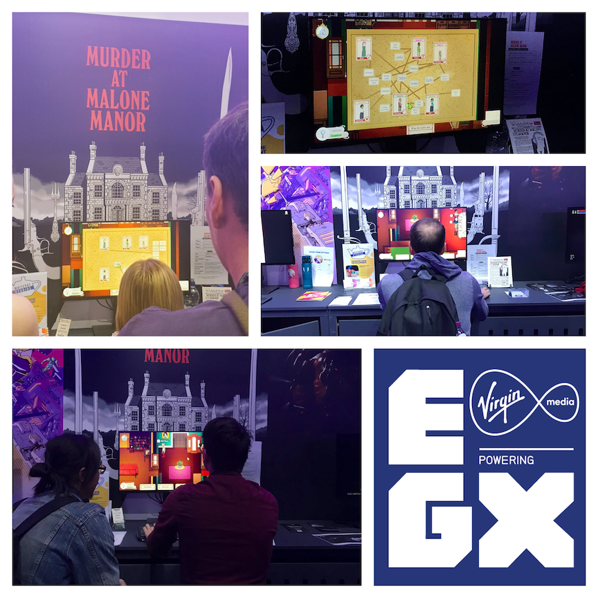
In October 2019, we had an amazing opportunity to showcase Murder At Malone Manor to the general public in London at EGX, the UK’s biggest gaming show. Across four days, we watched and listened as players gave us a mountain of actionable feedback at our demo booth – where we had a prototype single-player mode of Murder At Malone Manor setup, on a PC, with a keyboard and mouse.
We quickly identified that the keyboard and mouse isn’t for everyone. We already knew this and had always intended to add controller support prior to release, but seeing just how limiting only having one control scheme was when demoing to a tech-savvy, gaming-savvy audience showed us that we needed to redesign the UI from the ground-up, and how players interacted with the game as well.
Input method matters – and if you’re demoing at a public event with large crowds of the general gaming public, with massive crowds of console-only players, no-one has time to get a ‘feel’ for where WASD is on a particular keyboard, or where ‘tab’ is, and life-long Mac users aren’t going to want to wrestle with right-click on a mouse.
At this point, it can be really easy to dismiss players unfamiliar with your gaming control scheme as outside of your target player base – but these were all use cases we faced from EGX attendees who were fans of murder mystery games, board games with a traitor element, social deduction games, and who just generally were interested in Murder At Malone Manor.
EGX is, after all, the largest gaming show in the UK. Players who are there, ready to play your game, interested and engaged, are there for a reason. If your game has drawn them in, it’s on you as a developer to make sure your game is ready for them to pick up, catering to different control schemes, play styles, and input methods as best you can – with considerations for this built into design and development of your game from day one.
When getting back to the office after EGX, one of the first things we did was buy Rewired, a super-powerful input remapping tool. This allowed us (read: Robbie) to completely change the control scheme for Murder At Malone Manor, so it’s now naturally playable using either controller or keyboard and mouse.
Recurring Issues
From watching and listening to players, we were able to learn a lot about recurring accessibility issues they faced just at EGX alone. So without further adieu, the worst offenders (anecdotally) are:
Games with no option to change text size
Tiny UI size was brought up as an issue mostly in relation to consoles e.g. when you need to pull your living room chair reeeealllly close to the TV so you can actually see what’s going on. And it’s not just an indie thing, as outlined in this Reddit comment on the Red Dead Redemption 2 HUD:
But for sight-impaired players, not having an option to increase text size was the difference between being able to play and not play – Unity developers should be therefore be striving to make canvas scaling/text size/UI resolution options configurable in the player settings.
Cursor size
Windows, for example, allows the end-user to make a cursor as big or as small, or as bright or as dark, as they want.
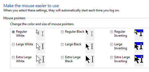
Which works totally fine – until an installed game overrides that with a very minimalist hard-to-see custom cursor. Provider the player with an option to increase/decrease cursor size, and don’t override the default setup at all if you can avoid it.
Text Contrast
The W3C contrast accessibility guidelines outline that visual presentation should ‘provide enough contrast between text and its background so that it can be read by people with moderately low vision (who do not use contrast-enhancing assistive technology).’
Good text readability doesn’t just mean avoiding red text on a green background, or avoiding dark text on a just-a-wee-bit-darker background. And again, it’s not just indies who miss this – a specific example given to us at EGX was around the contrast between foreground text and background text in Elder Scrolls online, which you can find discussed in this forum post.
Fortunately, there are tools to help developers avoid poor-contrast pitfalls. You can use a contrast checker such as https://webaim.org/resources/contrastchecker/ to measure your contrast ratios. For ‘standard’ sized text, the recommended accessible minimum is a 4.5:1 contrast ratio, with a recommended minimum of 3:1 for large text.
Equipment
Again I’d like to reiterate that a keyboard and mouse isn’t for everyone, and careful consideration should be given to the equipment you choose to bring to a conference as your games’ main input method. Even if players are familiar with a keyboard and mouse, and have no other accessibility or familiarity issues that would see them more comfortable using a controller, they still need to be able to use the keyboard and mouse provided with your demo. Many players with low-contrast vision issues rely on clearly backlit or different coloured WASD keys, so give careful consideration to your functionally backlit keyboards. A swathe of RGB pulsing light looks really cool, but may not be very practical mid-demo.
There’s a brief overview of some of the feedback we received re: accessibility at EGX, which we hope you’ll now know to look out for in other games moving forward.
– Vicky
UI Design
The New HUD
Malone Manor’s UI has been a big focus of mine over the past few months and it’s seen a varying number of iterations and re-designs in that time. We have a lot of information to convey to player’s and finding a way to do this cohesively has been a big topic of discussion for us. Luckily we were able to showcase a build of Malone Manor at EGX in October which gave us some invaluable feedback to build upon and base our designs on going forward. Amy and I had mocked up what I call “Phase 2” of Malone’s UI, which is what was shown at EGX, however it still had a few issues which we thought needed to be fixed.
As you can see from the image above there were several issues with this UI layout. The main one was contrast with text and their backgrounds. As you can see the font we were using can be a little hard to read, and even with the shadow and outline, doesn’t stand out enough from it’s background. The UI elements were also too split up and far apart – this layout makes good use of screen space however you can imagine that as a player having to look in one corner for your pocket, another corner for your role and another corner for the timer can get annoying. Having to dart your eyes about the screen doesn’t make for a good user experience and this was something that a few players mentioned at EGX as an issue.
To amend this, I thought about the idea of having a “bottom bar” that would contain all the necessary information that the player needs to play the game, thus fixing the issue of scattered UI elements. You can see Amy’s concept art for this below as well as my mockup in Unity (the game engine we use).
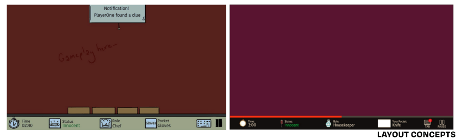
As you can see this new layout helps reinforce several things to the player. We added Tab and Pause indicators to remind the player that they can use these during gameplay (as some EGX players were unaware that they could press Tab to open their investigation board), we also added a countdown bar (the half full red line above the UI bar) which reminds the player that they are racing against the clock – as having a small timer in one corner didn’t do enough to convey this. Finally, you can see that we are now using either a very dark background colour and bright text, or the dark text and bright background, to enhance the contrast between the two.
A New Way to Look at Your Pause Menu
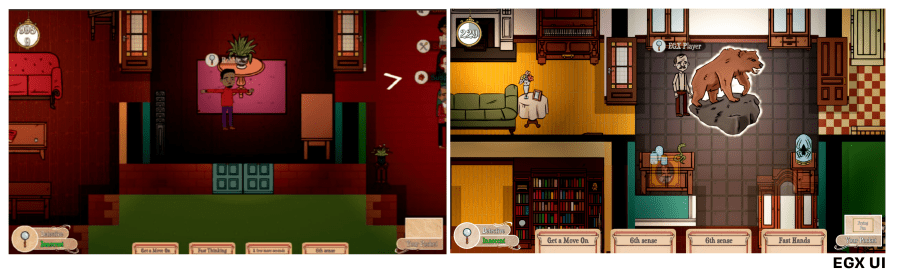
Another issue that was flagged by EGX players was that the game had too many popup windows – for example a popup would show up when you search an object, when you placed a clue at the dining table, when an event would start and when you gained an action card. Player’s found having to close these constantly a pain, especially if they couldn’t find the close button. It also interrupted the flow of gameplay which can frustrate you in a game where you’re fighting against the clock. We also didn’t have a good way of telling players that they had items in their pocket or had action cards to play – as if they didn’t check their HUD they could easily be missed. We needed a way to reinforce all of these things without having to display it all in a ton of menus. I suggested the following “Tab System” which would help combat a lot of these issues, an early version of which is shown below.
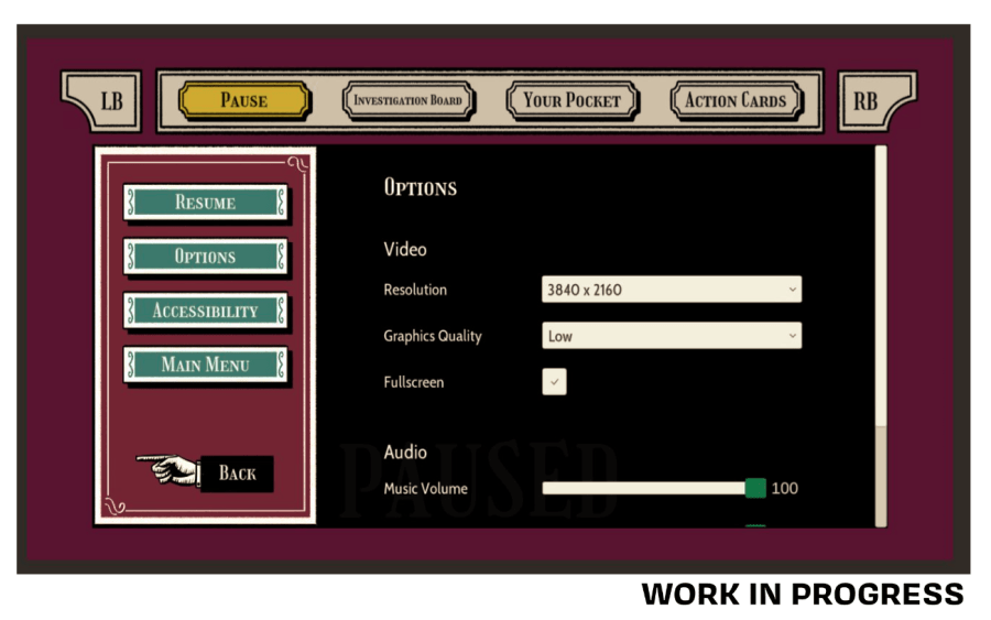
This menu comes up whenever the player pauses the game or opens their investigation board. The pause tab shows your pause menu, the board tab shows your investigation board, the pocket tab shows you which item you currently have in your pocket – as well as some information about items and clues, and the action cards tab shows you which action cards you currently have – as well as some information about them. This system helps to remind players that they can see their board at any time, and as the pocket and card tabs can always be seen when they do this or pause the game, it helps to further reinforce and inform the player about those systems (without having to rely on popup menus). This way it is almost impossible for a player to complete a game of Malone Manor without ever using their pocket or action cards – which happened a few times at EGX. It also allowed us to remove the present screen (another popup menu) which would appear when a player presented a clue at the dining table.
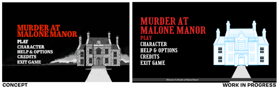
The New Main Menu
We have also been working on the opening menus of Malone Manor and I wanted to end this blog post with some of the work in progress designs that we’ve created so far.
– Robbie

Announcements
Some Discord Updates
We’re bringing back some of the dailies except now they’ll be monthlies. #MusicMonday, #FanFriday, and #ScreenshotSaturday will all be returning over the month of February. A new addition will be “Thursday! What a concept!” this is a day for showing appreciation for ideas and concepts that you think are cool.

Recommendations
Here’s what we’ve been reading, watching, listening to and playing the past month.
Adam: “I’ve been mostly been watching random normal TV but when I’m at the computer I’ve been catching up on this YouTube channel (Ants Canada) https://www.youtube.com/channel/UCONd1SNf3_QqjzjCVsURNuA. I’m still playing Destiny 2 (that season title’s not going to earn itself) but I’m slowing making my way through Death Stranding when I’m in the mood for a change of pace. I’ve also gotten back into the Warhammer painting flow since a friend of mine convinced me to start a Nighthaunt army!”
Vicky: “Reading – #TheChase hashtag at 5 pm on a weekday. Watching – Daytime TV from a hospital bed. Playing – Bargain Hunt. In spirit. Will get golden gavel someday”
Matt: I watched Uncut Gems, played a bit of A Plague Tale: Innocence and Read Seconds by Bryan Lee O’Malley. Started listening to Igor by Tyler, The Creator
Amy: “Been watching season 1 and start of season 2 of Haunter (would highly recommend if you like daft paranormal investigation shows), and also old episodes of the X-Files which are still enjoyable! Music-wise, Fleetwood Mac was a good January listen
Robbie: “Been watching the final few episodes of Bojack Horseman on Netflix, as well as Taylor Swifts Documentary: Miss Americana. Started playing House Flipper which allows me to live out my dreams as a successful renovator and decorator, its basically a Queer Eye Bobby Berk simulator, which is fantastic.”
Whitepot Playlist
Also, Robbie created a Spotify playlist for us to contribute too – if yous wanna listen to a mismatch of genres and tones.
We’ll be back in March with another update.
Bye for now,
Matt
0 Comments